Ripple effect in Android
What is Ripple?
Ripple is a small wave like pattern, generally formed on the surface of some liquid when you drop something on it.

What is Ripple effect in Android?
Ripple effect provides an instantaneous visual confirmation at the point of contact when users interact with UI elements.
These UI elements could be any of the View elements.
Like – Layouts, Buttons, TextViews, ListViews, etc.
Whenever the user clicks or touches any UI element like, a button, it is desirable to provide some kind of visual confirmation, so that the user knows that their touch or click was successful. Responsive interaction encourages deeper exploration of an app by creating timely, logical, and delightful screen reactions to the user input. However, this interaction should not be distracting to the user. Traditionally in Android, this has been handled using state list drawables to provide different colored or shaded drawables which indicate that a control is in touched or pressed state. With the Android Lollipop, a new touch feedback mechanism was introduced to provide this touch feedback and is loosely based on the concept of ripples on the card metaphor which features strongly in Material design. These ripples are actually really easy to implement.
When was it introduced?
In the android development ecosystem, it was added in Android 5.0: API 21(LOLLIPOP). So, it does not work on pre-lollipop devices. However, we have external libraries which can be used to give the same effect. Links for the same are provided at the end of the blog.
Class hierarchy followed is :
[sourcecode language=”java”]
java.lang.Object
↳android.graphics.drawable.Drawable
↳android.graphics.drawable.LayerDrawable
↳android.graphics.drawable.RippleDrawable
[/sourcecode]
How to achieve Ripple effect?
It can be achieved in 2 ways :
(a) Programmatically – by using RippleDrawable class.
(b) By XML – by using Drawable XML that shows a ripple effect in response to state changes of the View.
In order to understand how the ripple is drawn it would be nice to slow the animation down. The ripple animation runs slower when we perform a long press, so we can use that to see exactly what’s happening.
Programmatically
Our respective class will implement View.OnTouchListener interface.
It will provide us : public abstract boolean onTouch (View v, MotionEvent event) callback.
This is called, when a touch event is dispatched to a view.
Here, v : The view, the touch event has been dispatched to.
event : The MotionEvent object containing full information about the event.
This method returns True if the listener has consumed the event, False otherwise.
The anchoring position of the ripple for a given state is specified by calling setHotspot(float, float) with the corresponding state attribute identifier.
[sourcecode language=”java”]
private RippleDrawable rippleDrawable;
private Button buttonWithRipple;
buttonWithRipple = (Button) findViewById(R.id.buttonWithRipple);
rippleDrawable = (RippleDrawable) buttonWithRipple.getBackground();
buttonWithRipple.setOnTouchListener(this);
@Override
public boolean onTouch(View v, MotionEvent event) <
switch (v.getId()) <
case R.id.buttonWithRipple :
rippleDrawable.setHotspot(event.getX(), event.getY());
rippleDrawable.setColor(ColorStateList.valueOf(getResources().getColor(R.color.red)));
break; >
return false;
>
[/sourcecode]
Here, event.getX() & event.getY() gives us current pointer coordinates. And then, we set our required color to the rippledrawable object.

By XML
Setting DEFAULT Ripple effect on Android 5.0: API 21(LOLLIPOP) devices :
- If you want to apply the Standard ripple effect on Android 5.0: API 21 or more, which should be limited to your view (bounded ripple), just apply to your View background :
[sourcecode language=”java”]
android:background=»?android:attr/selectableItemBackground»
[/sourcecode]
This background attribute value :
will provide default ripple effect, which will constrain the animation, within the View that’s handling the touch event.
- If you want to apply the standard ripple effect on Android 5.0: API 21 or more, which should not be limited to your view (unbounded ripple), just apply to your View background :
[sourcecode language=”java”]
android:background=»?android:attr/selectableItemBackgroundBorderless»[/sourcecode]
This background attribute value :
[sourcecode language=”java”] selectableItemBackgroundBorderless[/sourcecode]
will provide default ripple effect, which will extend the animation beyond the bounds of its View that’s handling the touch event. It will be bounded by the nearest parent of the view with a non-null background.


Standard bounded Ripple Effect Standard Unbounded Ripple Effect
Setting CUSTOMISED Ripple effect on Android 5.0: API 21(LOLLIPOP) devices :
We create a touch feedback drawable that shows a ripple effect in response to state changes, using the ripple as root element.
This drawable may contain 0 or more child layers, including a special mask layer that is not drawn to the screen.
Attributes are as under :
- android:color – the color to use for ripple effects.
1. Must be a color value, in the form of “#rgb”, “#argb”, “#rrggbb”, or “#aarrggbb”.
2. This may also be a reference to a resource (in the form “@[package:]type:name”) or theme attribute (in the form “?[package:][type:]name”) containing a value of this type. This corresponds to the global attribute resource symbol color.
- android:radius – radius of the ripple when fully expanded.
1. Default value is computed based on the size of the ripple’s container.
2. Must be a dimension value, which is a floating point number appended with a unit (like : px, dp, sp, in, mm).
3. This may also be a reference to a resource (in the form “@[package:]type:name”) or theme attribute (in the form “?[package:] [type:]name”) containing a value of this type. This corresponds to the global attribute resource symbol radius.

USAGE :
Set this drawable as the background to your view :
- Drawable with only a mask layer and no child layer
If a mask layer is set and the ripple is set as a View background, the ripple effect will be masked against that layer.
- Drawable with a child layer and a mask layer
If a mask layer is set and the ripple is set as a View background, the ripple effect will be masked against that layer before it is drawn over the composite of the remaining child layers (if they exist).
Here, background color of button is changed by setting the child layer in the Ripple drawable XML.
- Drawable with no mask layer or child layer
If no child or mask layer is specified and the ripple is set as a View background, the ripple will be drawn atop the first available parent background within the View’s hierarchy.


Drawable with only a mask Drawable with a mask Drawable with no mask or
layer and no child layer layer and a child layer child layer
Below are the references to various libraries which can be used to apply Ripple Effect on Pre-Lollipop devices :
- https://github.com/siriscac/RippleView.git
- https://github.com/balysv/material-ripple.git
- https://github.com/traex/RippleEffect.git
- https://android-arsenal.com/tag/167
Thanks to Google for its Material Design 🙂
Источник
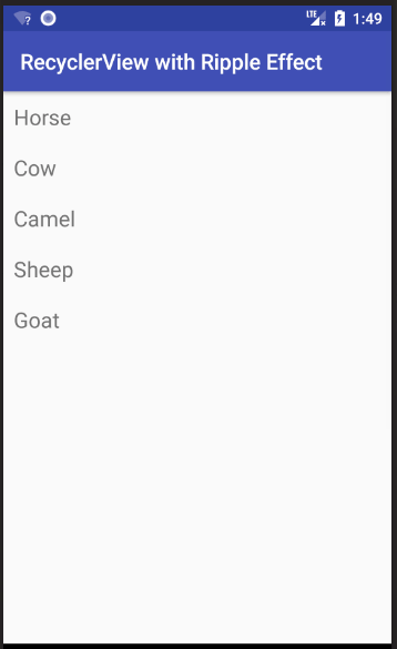
Adding a ripple effect to an Android RecyclerView item

Jan 12, 2019 · 2 min read
By default a RecyclerView item does not give a visual indication when you touch it. It may be simplest to use one of the following options in your RecyclerView row’s background:
However if you are experiencing problems with this method or if you want finer control over the colors, then you can do the following.
Custom Ripple Effect
This answer is starting with this simple Android RecyclerView example. It will look like the following image.
Add selector for pre API 21 devices
Before API 21 (A n droid 5.0 Lollipop), clicking a RecyclerView item just changed its background color (no ripple effect). That is what we are going to do, too. If you still have users with those devices, they are used to that behavior, so we aren’t going to worry about them too much. (Of course, if you really want the ripple effect for them, too, you could use a custom library.)
Right click your res/drawable folder and choose New > Drawable resource file. Call it custom_ripple . Click OK and paste in the following code.
I used colorAccent as the highlight color for the pressed state because it was already available, but you can define whatever color you want.
Add Ripple Effect for API 21+ devices
Right click your res/drawable folder and choose New > Drawable resource file. Call it custom_ripple again. Don’t click OK, yet this time, though. From the Available qualifiers list choose Version, then click the >> button and write 21 for the Platform API level. Now click OK and paste in the following code.
Again, I used colorAccent for the ripple color because it was available, but you can use whatever color you want. The mask confines the ripple effect to just the row layout. The mask color apparently doesn’t matter so I just used an opaque white.
Set as the background
In your RecyclerView item’s root layout, set the background to the custom ripple that we created.
In the example project that we started with, it looks like this:
Finished
That’s it. You should be able to run your project now. Thanks to this answer and this YouTube video for help.
Источник
Achieve toolbar menu item click ripple effect
I try to use padding to increase the touch area of a button. I use
The click area is enlarge. But, selectableItemBackgroundBorderless click effect no longer shown as a perfect circle.
I try to use duplicateParentState technique to overcome.
- The clicked area is enlarged.
- The selectableItemBackgroundBorderless circle effect is a perfect circle.
However, it seems to have some weird behavior. When I click on the actual area of the ImageButton , the circle press effect is not shown.
May I know why it is so, and how can I overcome it? I tested using API 26.
Note, I try to avoid using TouchDelegate technique, unless I’m forced to, as it makes our code more complicated.
Additional information
The following is the correct behavior, exhibited by the button for Toolbar .
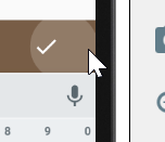
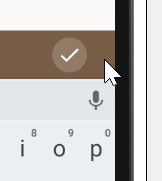
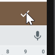
Ripple effect is shown when the click region is outside the button
Ripple effect is shown when the click region is within the button
However, I have no idea how they implement such behavior.


4 Answers 4
After spending some time I finally found how the «toolbar mystery» works. It’s ActionMenuItemView , that is being displayed on the toolbar. And you can see, that inside xml file it has style=»?attr/actionButtonStyle» applied to it. ?attr/actionButtonStyle corresponds to Widget.Material.ActionButton and within this style we can see ?attr/actionBarItemBackground .
If you want to apply the same effect to your ImageButton , then all you have to do is to apply android:background=»?attr/actionBarItemBackground» to it. Thus, having following xml layout:
You’ll receive this output:
Turned on «Show layout bounds» so that actual bounds of ImageButton are visible
If you are curious what ?attr/actionBarItemBackground actually represents, here’s it:
Thus, you can create your drawable and apply it as a background to ImageButton .
The ripples on Android 5.0 start in the center of each view. According to the Material Design rules, the ripples should start where the touch event occurs, so they seem to flow outward from the finger. This was addressed in Android 5.1, but was a bug in Android 5.0
To fix this, you need to use the setHotspot() method, added to Drawable in API Level 21. setHotspot() provides to the drawable a “hot spot”, and RippleDrawable apparently uses this as the emanation point for the ripple effect. setHotspot() takes a pair of float values, presumably with an eye towards using setHotspot() inside of an OnTouchListener , as the MotionEvent reports X/Y positions of the touch event with float values.
Thanks to The Busy Coder’s Guide book
You can use this code to correct the ripples bug:
in your first try:
I try to use padding to increase the touch area of a button.
you can use this code to put center of ripple at center of ImageButton :
maybe another solution when FrameLayout wraps ImageButton :
However, it seems to have some weird behavior. When I click on the actual area of the ImageButton, the circle press effect is not shown.
a work around for this problem may be to add frameLayout.performClick() in the onClick() method of ImageButton
or you can simulate a touch on frameLayout like this code when ImageButton is clicked:
Источник